Chapter 3 Examples
Here we provide examples of using different aspects of the conTree
package as applied to several data sets. These examples are intended to
illustrate some of the basic features, operation and control of the
package procedures. See the full documentation for more advanced
options.
3.1 Conditional probability estimation
Here we present R code and resulting output using conTree for the
analysis presented in Section 6.2 of J. H. Friedman (2020) using the census
income data. This sample, taken from 1994 US census data, consists of
observations from 48842 people divided into a training set of 32561 and
an independent test set of 16281. The binary outcome variable
\(y\in\{0,1\}\) indicates whether or not a person’s income is greater than
$50000 per year. There are 14 predictor variables \(\mathbf{x}\)
consisting of various demographic and financial properties associated
with each person. The goal is to contrast \(y\) with estimates of
\(\Pr(y=1\,|\,\mathbf{x})\) obtained by several machine learning methods:
gradient boosting on logistic scale using maximum likelihood (GBL),
random forest (RF), and gradient boosting on the probability scale (GBP)
using least–squares.
First load conTree package
The next step is to load and attach the data with the R command
This creates the following numeric vectors and data frames :
| Variable | Description |
|---|---|
x |
training data predictor variables (data frame) |
y |
training data outcome (high salary indicator) |
xt |
test data predictor variables (data frame) |
yt |
test data outcome |
gbl |
training data GBL estimates |
gblt |
test data GBL estimates |
rf |
training data RF estimates |
rft |
test data RF estimates |
gbp |
training data GBP estimates |
gbpt |
test data GBP estimates |
Note that all of the \(\Pr(y=1\,|\,\mathbf{x})\) estimates were obtained
using the training data (\(\mathtt{x}\),y) only.
Partition test data into two parts
Contrast \(y\) and GBL estimates using first part
Validate on second part which produces the command line output:
## $nodes
##  [1]  7  6 29 11 28 16  9 23 13 22
##
## $cri
##  [1] 0.11499156 0.10586120 0.09498529 0.08688654 0.06500579 0.04966835
##  [7] 0.04906626 0.04751317 0.03595857 0.02631912
##
## $wt
##  [1]  561  796  441  411  423  361 1612  431  795  450
##
## $avecri
## [1] 0.06556377
The first component $nodes lists the tree node identifiers for each
terminal node in order of region discrepancy. The second $cri gives
the actual discrepancy of each corresponding region. The third component
$wt shows the corresponding number of observations in each region. The
quantity $avecri is the observation weighted average discrepancy over
all regions.
The function nodeplots() produces the graphical tree summary shown
in Figure 3.1.
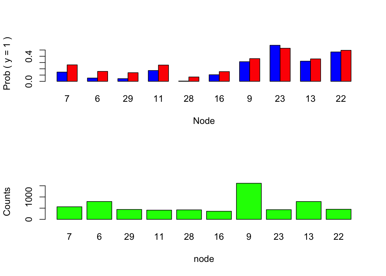
Figure 3.1: Graphical tree summary.
The blue bars in the upper barplot represent the empirical \(\Pr(y=1)\) in each region whereas the red ones show the mean of the GBL predictions in the corresponding regions. One sees dramatic over estimation of the small probabilities.
Region boundaries for selected nodes 7 and 29 can be obtained by:
## node 7  var     dir    split
##       cat 6      -     2 3 5
##       cat 7      -     1 2 7 8 9 10 11
## node 29  var     dir    split
##       cat 6      +     2 3 5
##       cat 8      -     1 4 6
##           5      -      12
##           1      +      28
Interpretation of this output is described in Section 2.4.
The command
obtains the terminal node identity for each test observation for the tree represented in Figure 3.1. The commands
plot(gblt[nx == 7], gbpt[nx == 7], pch = '.', xlab = 'GBTL', ylab = 'GBPT')
lines(c(0, 1), c(0, 1), col = 'red')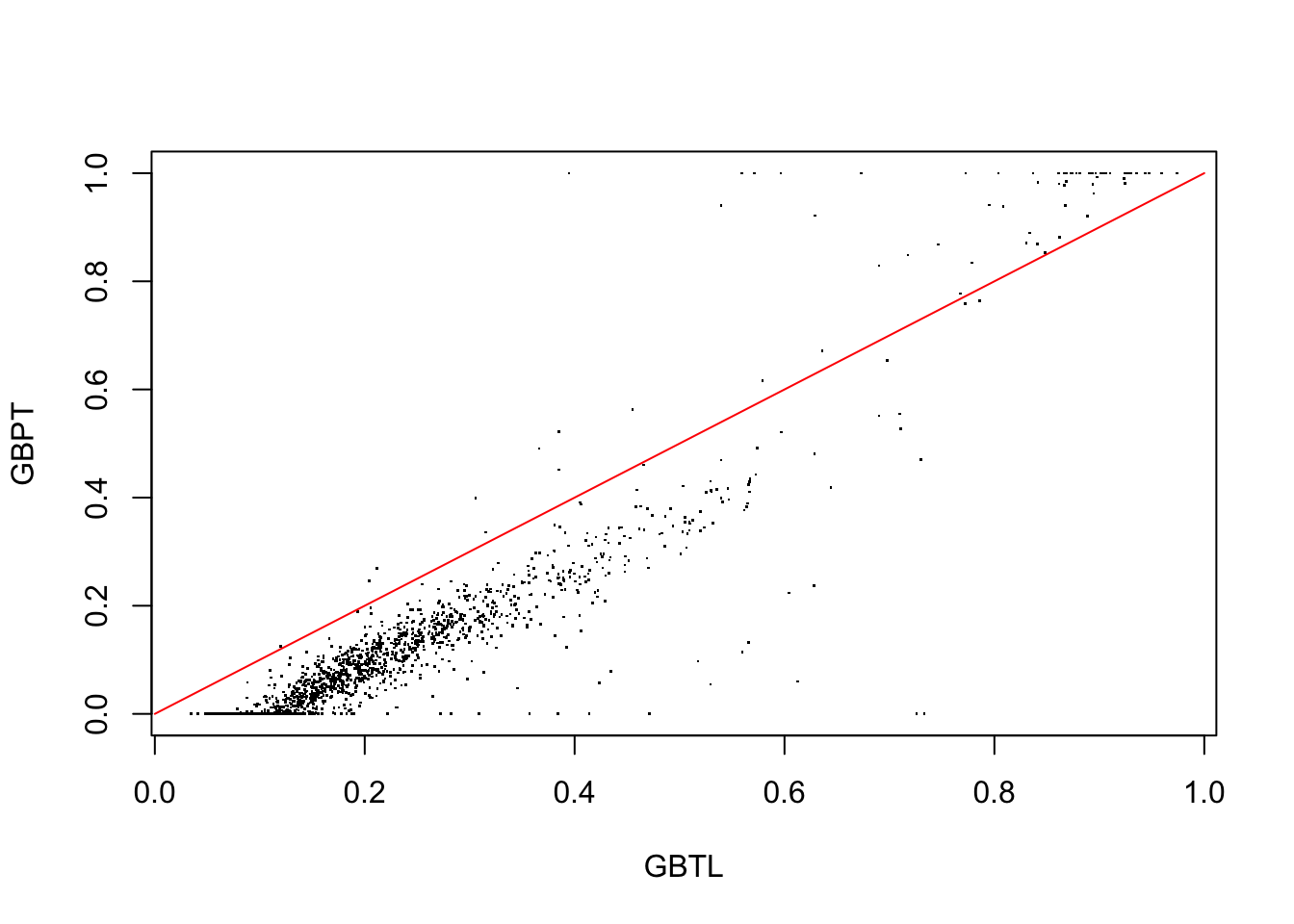
Figure 3.2: GBL vrsus GBP probability estimates for test data observations in region 7.
plot the test data GBP predictions against those of GBL for the highest discrepancy region 7. The red line represents equality. The result shown in Figure 3.2 indicates that the gradient boosting probabilities based on log-odds estimates in this region are considerably larger but proportional to those obtained by direct probability estimation using least-squares. One also sees the effect of truncating the out of range estimates produced by the latter. In spite of this the GBP probability estimates are seen in Figure 3.3 (below) to be from three to four times more accurate than those of GBL
We next plot the lack-of-fit contrast curve for GBL using a 50 terminal node contrast tree
tree = contrast(xt[dx,], yt[dx], gblt, type = 'prob', tree.size = 50)
lofcurve(tree, xt[dxt,], yt[dxt], gblt[dxt], doplot = 'first')
Next we add the corresponding curve for RF predicted probabilities
tree = contrast(xt[dx, ], yt[dx], rft[dx, 2], type = 'prob', tree.size = 50)
lofcurve(tree, xt[dxt, ], yt[dxt], rft[dxt, 2], doplot = 'next', col = "blue")
And finally that for the GBP estimates
tree = contrast(xt[dx, ], yt[dx], gbpt[dx], type = 'prob', tree.size = 50)
lofcurve(tree, xt[dxt, ], yt[dxt], gbpt[dxt], doplot = 'next', col = "red")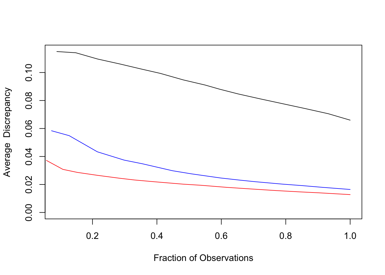
Figure 3.3: Lack-of-fit contrast curves for GBL (black), RF (blue), and GBP (red) for census income data.
The result is shown in Figure 3.3.
3.2 Contrast boosting
Here we illustrate the use of contrast boosting to improve prediction performance of GBL. The model is built using the training data with the command
We can plot tree average discrepancy versus iteration number on the training data and super impose a corresponding plot based on the test data set with the commands:
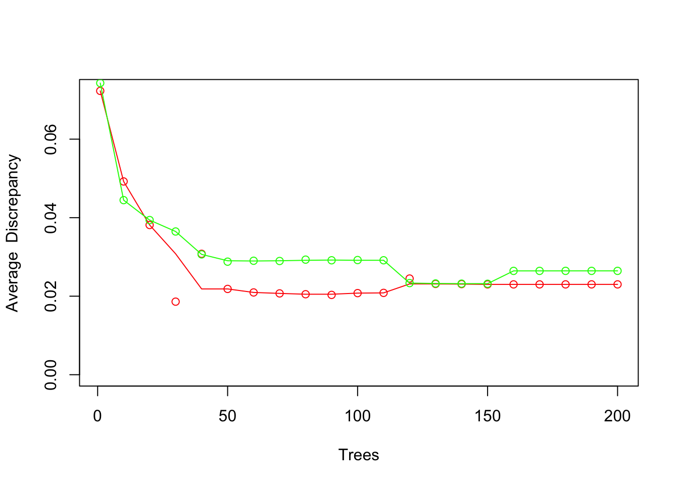
Figure 3.4: xval(x, y, gbl, modgbl, col = 'red')
The result is shown in Figure 3.4. Note that results at every tenth iteration are shown.
Model predictions on the test data set can be obtained with the command
These can be contrasted with the \(y\) - values using the first test set sample
and summarized on the other test sample with the command
![`nodeplots(tree, xt[dxt, ], yt[dxt], hblt[dxt])`](conTree_tutorial_files/figure-html/fig5-1.png)
Figure 3.5: nodeplots(tree, xt[dxt, ], yt[dxt], hblt[dxt])
producing Figure 3.5.
Comparing with Figure 3.5 one sees that contrast boosting the GBL model appears to have substantially reduced the shrinking of the of the extreme probabilities estimates thereby improving its conditional probability estimation accuracy.
One can boost the RF and GBP models in the same way using the commands analogous with those used here for the GBL model. Additionally, lack-of-fit contrast curves can be produced and plotted for all three boosted models using modifications of the corresponding commands above. The results are shown in Fig. 4 of Friedman (2020).
3.3 Conditional distributions
We illustrate contrasting and estimating conditional distributions \(p_{y}(y\,|\,\mathbf{x})\) using the demographics data set described in Table 14.1 of Hastie, Tibshirani and Friedman (2008). Here we attempt to estimate a persons age as a function of the other 13 demographic variables. For this data set age value is reported as being in one of seven intervals \[age\in\text{\{13-17, 18-24, 25-34, 35-44, 45-54, 55-64,}\geq\text{ 65\}.}\] As input to the algorithm each persons age is randomly generated uniformly within its corresponding reported interval. For the last interval an exponential distribution was used with mean corresponding to life expectancy after reaching age 65.
We first load the data and attach it.
This loads the following numeric vectors and data frames:
| Variable | Description |
|---|---|
xage |
outcome variable (age) |
yage |
predictor variables (other demographics - data frame) |
gbage |
gradient boosting model for median (yage \(\vert\) xage) |
The command
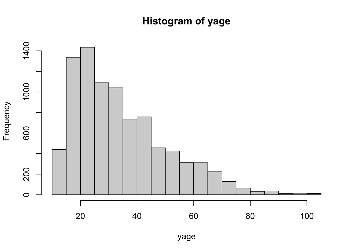
Figure 3.6: hist(age)
produces the marginal age distribution as seen in Figure 3.6.
This data is divided into training and test data subsets
We next contrast the distribution of \(y\,|\,\mathbf{x}\) with that of the no information hypothesis \(p_{y}(y\,|\,\mathbf{x})=\hat{p}_{y}(y)\) where \(\hat {p}_{y}(y)\) is the empirical marginal \(y\) - distribution independent of \(\mathbf{x}\) as shown in Figure 3.6. First create independent marginal distribution of \(y\) as the contrasting distribution
Then contrast with \(y\) - distribution
with tree test set command line summary produced by
## $nodes
## [1]  7  6 17 26 11 27  4 20
##
## $cri
## [1] 0.9600578 0.7737634 0.5972841 0.5755558 0.5276239 0.4381393 0.1946532
## [8] 0.1542807
##
## $wt
## [1]  320  597  268  367  304  294 1477  229
##
## $avecri
## [1] 0.4544866
and graphical summary produced by
![`nodeplots(treezage, xage[dt, ], yage[dt], zage[dt])`](conTree_tutorial_files/figure-html/fig7-1.png)
Figure 3.7: nodeplots(treezage, xage[dt, ], yage[dt], zage[dt])
shown in Figure @ref{fig:fig7).
Each frame in Figure @ref{fig:fig7) shows a QQ-plot of the distribution of age \(y\) versus that of its \(\mathbf{x}\) independent marginal counterpart (Figure 3.6) in each of eight regions returned by contrast. To the extent the two distributions are similar the points would lie close to the diagonal (red) line. Here they are see to be very different indicating that \(p_{y}(y\,|\,\mathbf{x})\) is highly dependent on \(\mathbf{x}\).
We next construct \(y_{B}\sim p_{B}(y\,|\,\mathbf{x)}\), the residual bootstrap approximation to \(p_{y}(y\,|\,\mathbf{x)}\) using gradient boosting median estimates for its location. This assumes that \(p_{y}(y\,|\,\mathbf{x)}\) is homoskedastic with varying location
and contrast \(y\) with \(y_{B}\) on the test data
![`nodeplots(treerbage, xage[dt, ], yage[dt], rbage[dt])`](conTree_tutorial_files/figure-html/fig8-1.png)
Figure 3.8: nodeplots(treerbage, xage[dt, ], yage[dt], rbage[dt])
The result is shown in Figure @ref{fig:fig8).
Although not perfect, the residual bootstrap \(p_{B}(y\,|\,\mathbf{x)}\) is seen to provide a much closer approximation to \(p_{y}(y\,|\,\mathbf{x)}\) than the global marginal \(p_{y}(y)\). This indicates that its location has a strong dependence on \(\mathbf{x}\) as captured by the gradient boosting conditional median estimate.
Next we attempt to further improve the estimate of \(p_{y}(y\,|\,\mathbf{x)}\) by applying distribution boosting to the training data starting with the residual boostrap approximation.
The commands
xval(mdlrb, xage[dl, ], yage[dl], rbage[dl], col = 'red')
xval(mdlrb, xage[dt, ], yage[dt], rbage[dt], col = 'green', doplot = 'next')![`xval(mdlrb, xage[dl, ], yage[dl], rbage[dl], col = 'red')`](conTree_tutorial_files/figure-html/fig9-1.png)
Figure 3.9: xval(mdlrb, xage[dl, ], yage[dl], rbage[dl], col = 'red')
produce a plot of training (red) and test (green) data average tree discrepancy as a function of iteration number (every 10th iteration) as shown is Figure 3.9.
The command
transforms the test data residual bootstrap distribution \(y_{B}\sim p_{B}(y\,|\,\mathbf{x)}\) to the \(y\) distribution estimate \(\hat{y}\sim\hat{p}_{\hat{y}}(y\,|\,\mathbf{x)}\).
The commands
treehrbage = contrast(xage[dt, ], yage[dt], hrbage, tree.size = 9, min.node = 200)
nodeplots(treerbage, xage[dt, ], yage[dt], hrbage)![`nodeplots(treerbage, xage[dt, ], yage[dt], hrbage)`](conTree_tutorial_files/figure-html/fig10-1.png)
Figure 3.10: nodeplots(treerbage, xage[dt, ], yage[dt], hrbage)
contrast the transformed distribution \(\hat{y}\) with that of \(y\) on the test data. Results are shown in Figure 3.10.
As seen the results are not perfect but somewhat better than that for the residual bootstrap distribution shown in Figure 3.8. This is verified by the corresponding lack-of-fit contrast curves shown in Figure 3.11 as produced by the commands
lofcurve(treezage, xage[dt, ], yage[dt], zage[dt], doplot = 'first')
lofcurve(treerbage, xage[dt, ], yage[dt], rbage[dt], doplot = 'next', col = "blue")
lofcurve(treehrbage, xage[dt, ], yage[dt], hrbage, doplot = 'next', col = "red")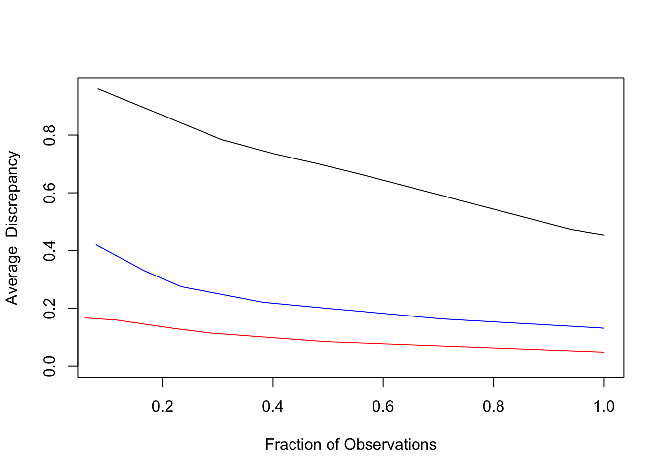
Figure 3.11: Lack-of-fit contrast curves
The lack-of-fit contrast curves are plotted for the three estimates of \(p_{y}(y\,|\,\mathbf{x})\): global marginal \(p_{y}(y)\) (black), residual bootstrap \(p_{B}(y\,|\,\mathbf{x)}\) (blue) and distribution boosting estimate \(\hat{p}_{y}(y\,|\,\mathbf{x})\) (red). Distribution boosting is seen to improve the accuracy of the conditional distribution estimate by roughly a factor of two.
Finally we estimate \(p_{y}(y\,|\,\mathbf{x})\) at \(\mathbf{x}\) - values for nine selected observations
at 500 quantile values
and plot their CDFs with
opar <- par(mfrow=c(3,3))
for (k in 1:9) {
    plot(ydist(mdlrb, xage[obs[k], ], gbage[obs[k]] + qres), p, type = 'l', xlim=c(13, 100),
         xlab = 'Age', main = paste('Observation', as.character(obs[k])))
    points(yage[obs[k]], 0, col = 'red')
    title(paste('Observation', obs[k]))
}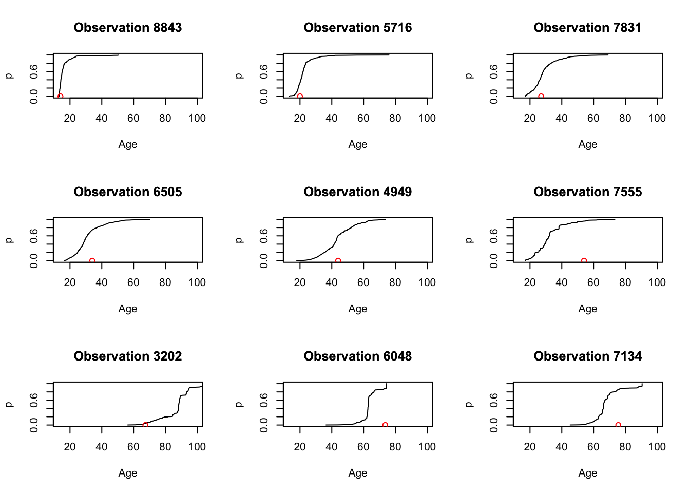
Figure 3.12: CDF estimates for nine \(\mathbf{x}\)-values.
as shown in Figure @ref{fig:fig12). The red points shown at the bottom of each plot display the actual realized \(y\) - value (age) for that observation. Prediction intervals for each observation can be read directly from its corresponding CDF display.
Probability densities for these observations can be visualized with the commands
opar <- par(mfrow = c(3,3))
for (k in 1:9) {
    hist(ydist(mdlrb, xage[obs[k], ], gbage[obs[k]] + qres), xlim = c(13, 100), nclass = 10,
         xlab = 'Age', main = paste('Observation', as.character(obs[k])))
    points(yage[obs[k]], 0, col = 'red')
    title(paste('Observation', obs[k]))
}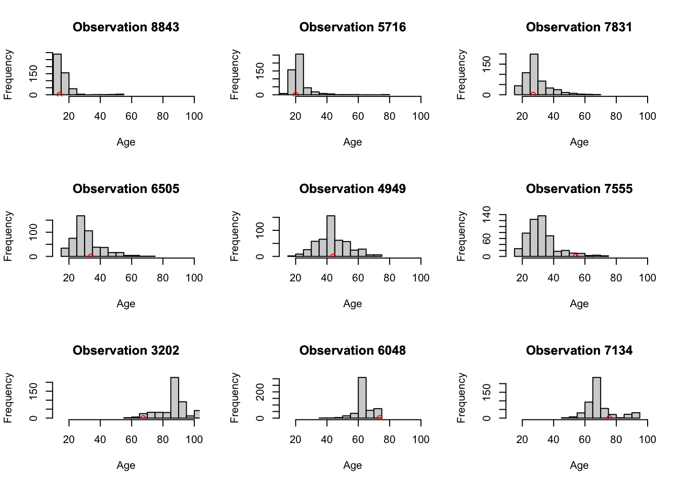
Figure 3.13: Corresponding probability densities for the nine observations.
as seen in Figure 3.13.
Considerable heteroskedasticity and skewness in the estimated conditional distributions are evident.
3.4 Two sample contrast trees
The use of two sample contrast trees is illustrated on the air quality data set also from the Irvine Machine Learning Data Repository. The data set consists of hourly averaged measurements from an array of 5 metal oxide chemical sensors embedded in an air quality chemical multisensor device. The outcome variable \(y\) is the corresponding true hourly averaged concentration CO taken from a reference analyzer. The input variables \(\mathbf{x}\) are taken to be the corresponding hourly averaged measurements of the other 13 quantities as described at the download web site. The goal here is to contrast the conditional distribution of \(y|\,\mathbf{x}\) for data taken in the first six months (January – June) to that of the last six months (July – December).
The first step is to load the data
This loads in three vectors and a data frame
| Variable | Description |
|---|---|
yco |
outcome variable (CO concentration) |
xco |
predictor variables (data frame) |
zco |
sample membership indicator |
pr2 |
probability propensity score. |
The first quantity yco is the outcome variable \(y\), xco is a data
frame containing the 13 predictor variables \(\mathbf{x}\) for each
observation and zco indicates sample membership: zco < 0
\(\Rightarrow\) first six months, zco > 0 \(\Rightarrow\) last six months.
The vector pr2 contains gradient boosting model predictions for
\(\Pr(z>0\,|\,\mathbf{x})\); that is the predicted probability of each
observation belonging to the second sample as estimated from the
predictor variables.
We first contrast the means \(E(y\,|\,\mathbf{x})\) of the different samples as a function of \(\mathbf{x}\). The command
## [1] 23.56415 22.98108displays the global means of the two samples with mean difference \(0.058\).
We first create learning and test data sets
and contrast the means as a function of \(\mathbf{x}\) as follows.
tree = contrast(xco[dl, ], yco[dl], zco[dl], mode = 'twosamp', type = 'diffmean')
nodesum(tree, xco[dt,], yco[dt], zco[dt])
## $nodes
## [1] 11 21 9 17 2 24 31 33 10 32
##
## $cri
## [1] 11.567835 6.843162 5.834586 4.559732 3.305389 3.269056 2.079791
## [8] 2.008699 1.224605 1.036612
##
## $wt
## [1] 307 292 250 287 334 309 275 314 349 640
##
## $avecri
## [1] 3.790423Here cri represents the mean difference in each of the nine regions uncovered by the contrast tree. One sees that there are local regions of the \(\mathbf{x}\) - space where the mean difference between the two samples is much larger than that of the global means.
Since the contrast tree regions are of finite extent mean differences within each can originate from two sources. One is due to actual differences in the conditional distributions \(p_{y}(y\,|\) \(\,\mathbf{x,\,}z<0)\,\) and \(p_{y}(y\,|\,\mathbf{x,\,}z>0)\) in the region. The other is differences in the marginal \(\mathbf{x}\) - distributions \(p_{\mathbf{x}}(\mathbf{x}\,|\,z<0)\) and \(p_{\mathbf{x}}(\mathbf{x}\,|\,z>0)\) over each individual region. Since interest is usually in the former one can mitigate the influence of the latter by propensity weighting based on the propensity probability scores. The command
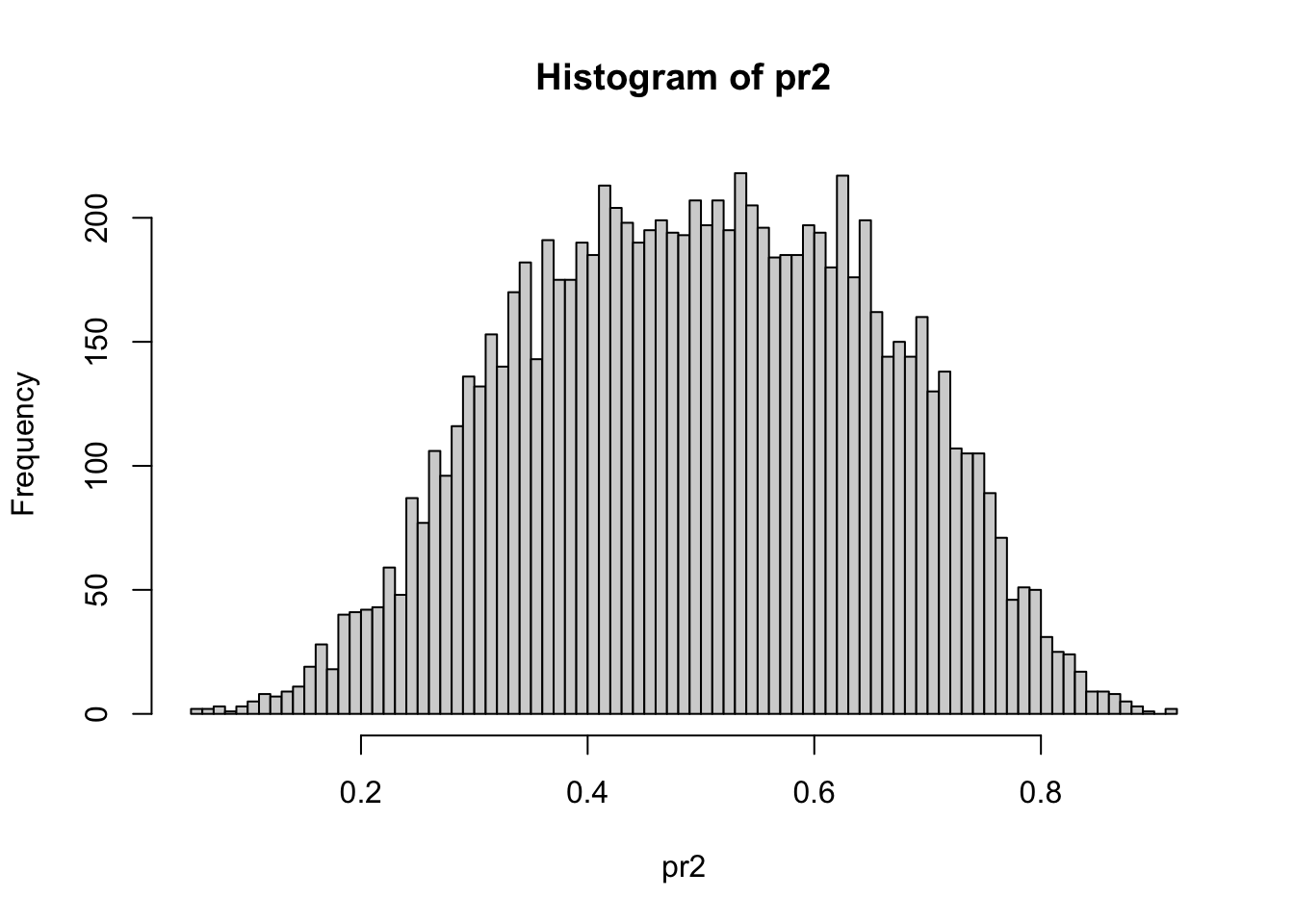
Figure 3.14: hist(pr2, nclass = 100)
displays the distribution of the input propensity probability scores in Figure 3.14. One sees that there are moderate differences between the \(\mathbf{x}\) - distributions of the two samples at least globally.
The propensity weights are calculated with the commands
wp = rep(0, length(zco))
wp[zco > 0] = 1 / pr2[zco > 0]
wp[zco < 0] = 1 / (1 - pr2[zco < 0])
wp = length(wp) * wp / sum(wp)
The corresponding (weighted) contrast tree is obtained as below.
tree = contrast(xco[dl, ], yco[dl], zco[dl], w = wp[dl], mode = 'twosamp', type = 'diffmean')
nodesum(tree, xco[dt, ], yco[dt], zco[dt], w = wp[dt])
## $nodes
## [1] 11 25 17 9 21 28 10 34 2 35
##
## $cri
## [1] 8.43006534 6.82843552 4.06862342 3.77038131 2.98880825 2.15116385
## [7] 1.18141501 1.15381494 0.70247866 0.04491301
##
## $wt
## [1] 322.7211 331.9136 266.6065 293.6267 404.4632 347.7717 381.3395 582.1445
## [9] 353.6817 296.8669
##
## $avecri
## [1] 2.937557The component $wt contains the sum of the weights in each region. Although discrepancies remain, they are somewhat reduced when accounting for the differences of the \(\mathbf{x}\) - distributions within each region. The command
![`nodeplots(tree, xco[dt,], yco[dt], zco[dt], w = wp[dt])`](conTree_tutorial_files/figure-html/fig15-1.png)
Figure 3.15: nodeplots(tree, xco[dt,], yco[dt], zco[dt], w = wp[dt])
produces the graphical summary shown in Figure 3.15. The red/blue bars on the lower plot represent the fraction of the total weights of the first/second sample in each region.
A reference (null) distribution for two sample tree statistics under the hypothesis of no difference between the samples can be obtained by permutation testing. The analysis is repeatedly performed with randomly permuted \(z\) - values, thereby randomly assigning observations to each sample. The commands
avedisc = rep(0, 1000)
set.seed(13)
for (k in 1:1000) {
    zcot = zco[sample.int(length(zco))]
    tre = contrast(xco[dl, ], yco[dl], zcot[dl], mode = 'twosamp', type = 'diffmean')
    avedisc[k] = nodesum(tre, xco[dt,], yco[dt], zcot[dt])$avecri
}
hist(avedisc, xlim = c(0, 4))
points(c(2.937557, 3.790423), c(0, 0), col = c('blue', 'red'))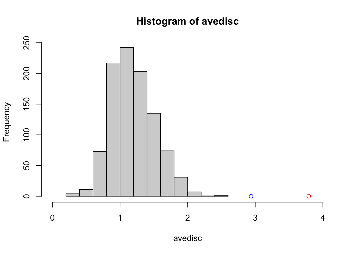
Figure 3.16: Two sample null distribution.
compute and display average tree discrepancy for 1000 replications of this procedure. Figure 3.16 shows the histogram of these null discrepancies along with the corresponding propensity weighted/unweighted alternatives shown as the blue/red points. One sees that the results based on the original sample assignments are highly significant.
The command
## node 11  var     dir    split
##           12      +      106
##           13      +      5232
##           2      +      1112
## node 25  var     dir    split
##           12      +      106
##           13      -      5232
##           13      -      4600
##           12      -      596
##           6      -      334
##           5      +      1036
produces the command line output.
As described in Section 2.4 the output for each terminal node shows the sequence of splits that produced its corresponding region. The names corresponding to each predictor variable can be obtained with the command
##  [1] "Time"          "PT08.S1.CO."   "NMHC.GT."      "C6H6.GT."
##  [5] "PT08.S2.NMHC." "NOx.GT."       "PT08.S3.NOx."  "NO2.GT."
##  [9] "PT08.S4.NO2."  "PT08.S5.O3."   "T"             "RH"
## [13] "AH"
so that the boundaries of nodes 11 and 25 are defined by
| Node | Rule |
|---|---|
11 |
RH>106 & AH>5232 & NMHC.GT >1112 |
25 |
106<=RH< 596 & AH<=4600 & NOx.GT<334 |
We next contrast the conditional distributions \(y\,|\,\mathbf{x}\) of the two samples. Figure 3.17 shows a QQ-plot between the respective \(y\) global distributions on the test data obtained by the commands
ycodt = yco[dt]
qqplot(ycodt[zco[dt] < 0], ycodt[zco[dt] > 0], pch = '.')
lines(c(0, 200), c(0, 200), col = 'red')![`qqplot(ycodt[zco[dt] < 0], ycodt[zco[dt] > 0], pch = '.')`](conTree_tutorial_files/figure-html/fig17-1.png)
Figure 3.17: qqplot(ycodt[zco[dt] < 0], ycodt[zco[dt] > 0], pch = '.')
The global \(y\) - distributions of the two samples are seen to be nearly identical. The corresponding (propensity weighted) contrast tree results are obtained with the commands
tree = contrast(xco[dl, ], yco[dl], zco[dl], w = wp[dl], mode = 'twosamp', tree.size = 9)
nodeplots(tree, xco[dt,], yco[dt], zco[dt], w = wp[dt])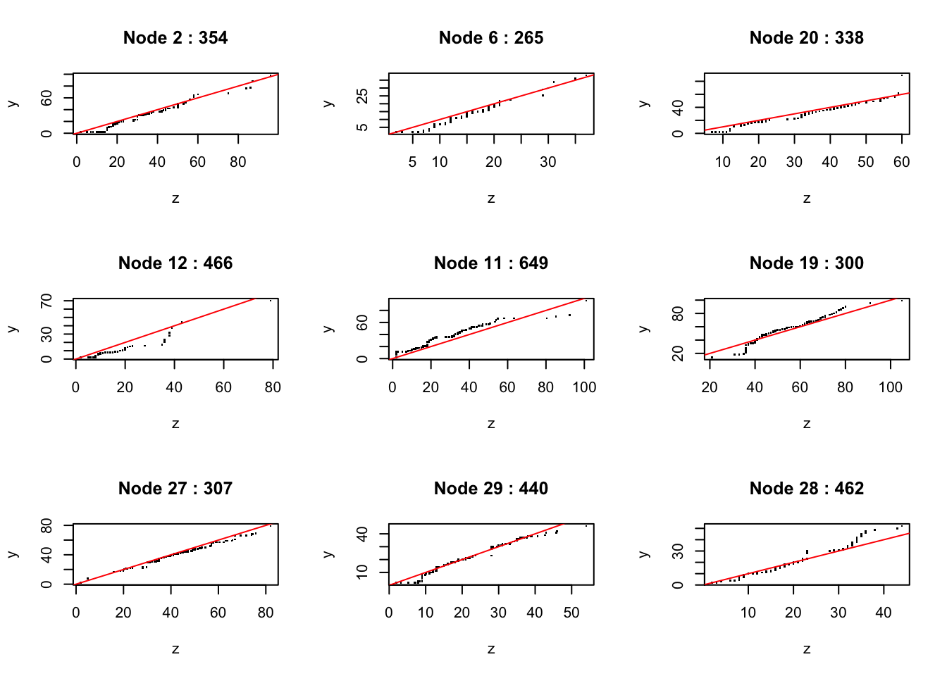
as shown in Figure @ref{fig:fig16). The tree has uncovered a few regions where there are moderate differences between the two distributions.
3.5 Session Information
## R version 4.3.0 (2023-04-21)
## Platform: x86_64-apple-darwin22.4.0 (64-bit)
## Running under: macOS Ventura 13.4
##
## Matrix products: default
## BLAS:   /usr/local/Cellar/openblas/0.3.23/lib/libopenblasp-r0.3.23.dylib
## LAPACK: /usr/local/Cellar/r/4.3.0_1/lib/R/lib/libRlapack.dylib;  LAPACK version 3.11.0
##
## locale:
## [1] en_US.UTF-8/en_US.UTF-8/en_US.UTF-8/C/en_US.UTF-8/en_US.UTF-8
##
## time zone: America/Los_Angeles
## tzcode source: internal
##
## attached base packages:
## [1] stats     graphics  grDevices datasets  utils     methods   base
##
## other attached packages:
## [1] conTree_0.3        rmarkdown_2.21     knitr_1.42         pkgdown_2.0.7
## [5] devtools_2.4.5     usethis_2.1.6.9000
##
## loaded via a namespace (and not attached):
##  [1] sass_0.4.6        stringi_1.7.12    digest_0.6.31     magrittr_2.0.3
##  [5] evaluate_0.21     bookdown_0.34     pkgload_1.3.2     fastmap_1.1.1
##  [9] jsonlite_1.8.4    processx_3.8.1    pkgbuild_1.4.0    sessioninfo_1.2.2
## [13] urlchecker_1.0.1  ps_1.7.5          promises_1.2.0.1  purrr_1.0.1
## [17] jquerylib_0.1.4   cli_3.6.1         shiny_1.7.4       rlang_1.1.1
## [21] crayon_1.5.2      ellipsis_0.3.2    remotes_2.4.2     cachem_1.0.8
## [25] yaml_2.3.7        tools_4.3.0       memoise_2.0.1     httpuv_1.6.11
## [29] vctrs_0.6.2       R6_2.5.1          mime_0.12         lifecycle_1.0.3
## [33] stringr_1.5.0     fs_1.6.2          htmlwidgets_1.6.2 miniUI_0.1.1.1
## [37] callr_3.7.3       bslib_0.4.2       later_1.3.1       glue_1.6.2
## [41] profvis_0.3.8     Rcpp_1.0.10       highr_0.10        xfun_0.39
## [45] rstudioapi_0.14   xtable_1.8-4      htmltools_0.5.5   compiler_4.3.0
## [49] prettyunits_1.1.1